B-LINE

Branding
a network

The B-line bus network was developed to increase services to Auckland’s busiest corridors. Diadem came along for the ride.

Diadem was engaged to design, document and provide guidelines for the new brand’s signage, environmental graphics, bus livery and print collateral.

Client

Auckland Regional Transport Authority

Bringing a
new brand to life

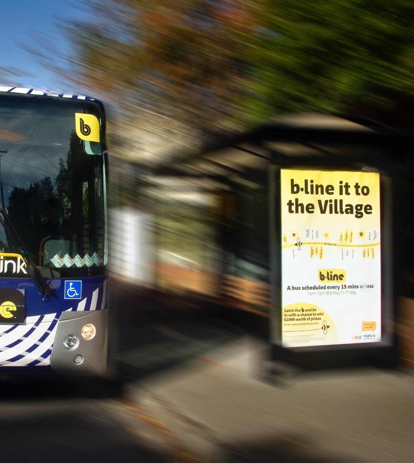
Auckland’s B-line express bus network introduced crucial transport infrastructure to key arterials across the city, including busy Dominion Road and Mt Eden Road.

Auckland Regional Transport Authority engaged Diadem to determine signage locations at all B-line bus stops, which totalled over 100 throughout the network. Diadem carefully audited each B-line route and stop, considering optimal viewing heights, scale and legibility to provide an efficient and accessible commuter journey.

Diadem was subsequently engaged to realise the new B-line brand in three-dimensional form. The bold and distinctive yellow and black brand was applied to a range of B-line assets, including shelters, signage elements and the buses themselves as livery.

Ensuring
future consistency

Diadem created high-visibility bus shelter signage to clearly identify B-line stops using primary elements, including the brand’s distinctive logo, colour and flower motifs.

A kit of parts now ensures future rollouts will consider all decal elements. These include glazing signage flower motifs, designed in a modular configuration for easy replacement.

The shelter branding was extended across benches, real-time displays, poles and identification decals. These stops are now an easily identified part of Auckland’s public transport network.

Connect.
Enquire.

Get in touch to start
a conversation.

Multistep Form

1
2
3