Why branded environments matter
When a brand is executed well, it can reflect a point of view, a sense of place, and tells a story that connects the user to where they are.
Let’s look at Commercial Bay as an example. Touted as the most transformational precinct Auckland has ever seen, Commercial Bay has injected new energy into the city and features office, internationally renowned retail, public space and high-end hospitality. A key part of Auckland’s thriving CBD, it re-establishes the area as a mecca for business, retail, leisure and wellness.
The focal point of the new urban landscape is a 39-storey office tower dubbed the PwC Tower with bars, eateries and shops making up the base, and pristine bay views to the north, east and west.
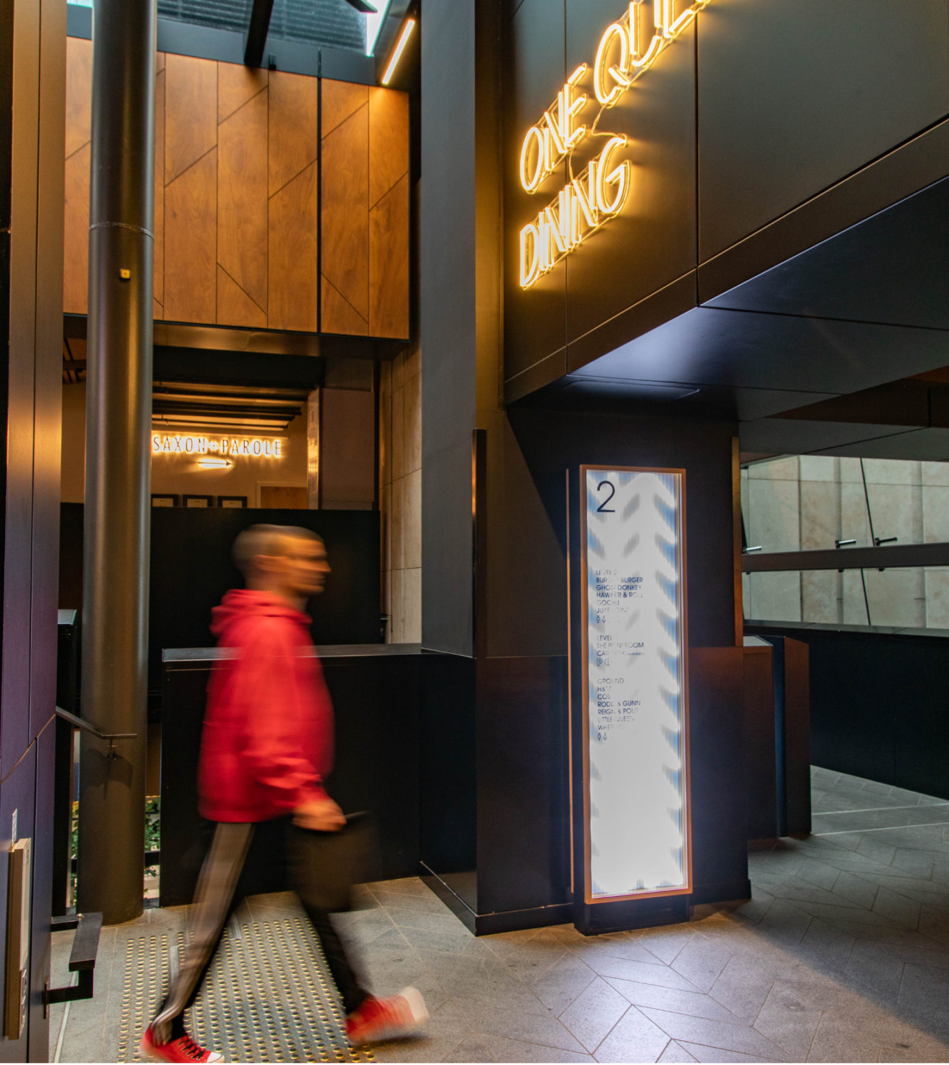
At the precinct’s conceptual stage, Diadem developed a user-oriented strategy, taking into consideration the many different user types to ensure users such as people commuting through as well as those working within the precinct might transition from business to leisure. The final result is a beautiful user-led wayfinding solution that unifies the area and creates a sense of meaning and place.
Chevrons taken from the site’s architecture are displayed on the glass light boxes, and the Avant-garde gothic font brings a sense of nostalgia while delivering optimum legibility.
In the PwC Tower lobby, the digital directory aligns with the building’s architecture and engages patrons by displaying news and weather updates, event information and art, and also serves as an emergency information system.
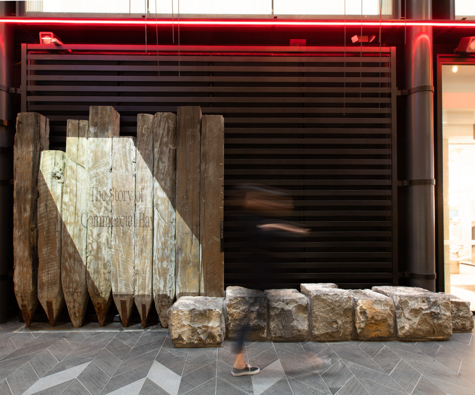
From the excess materials left on-site post-excavation, Diadem designed a ‘heritage wall’, where video is used to showcase the history of Commercial Bay. Diadem also executed the PwC sky sign on the northern face of the tower, which is the biggest PwC sign in Australasia.


